
£12.00
You’ll also earn 10% credit towards future orders
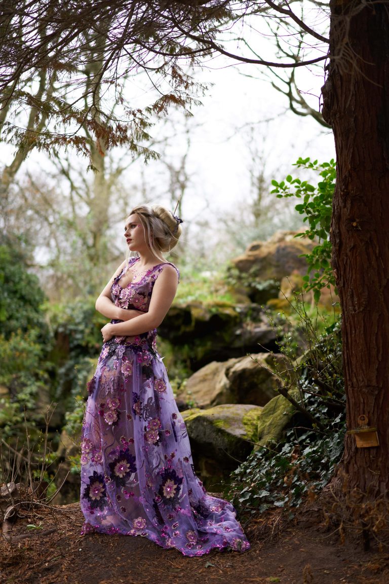
A versatile collection of styles designed to recreate the look of the latest version of Kodak Portra 400, a much-loved professional film emulsion. Natural and subtle enough for everyday use, but lovers of more extreme film looks won’t go hungry either with the more intense styles!
Although this stylepack is based on a single film stock (the latest iteration of P400), it’s really a set of versatile looks designed to be used for everyday, bread-and-butter tweaks to make digital images a little less clinical. You can go from a barely-perceptible hint of mojo to a crazy vintage colour grade, and anything inbetween. It may not be a precise laboratory recreation using thousands of painstakingly calibrated scans, but I think it captures the spirit of a classic negative film without drawing attention to itself…
There are 8 variations, offering varying intensity and tonality. All presets are fully layer-compatible for the latest versions of C1; I highly recommend using each style on a separate layer so you can dial in the exact strength you want. There are also matching presets to add varying film grain and analog softness to each look, for those trying to get as close to real film as possible.
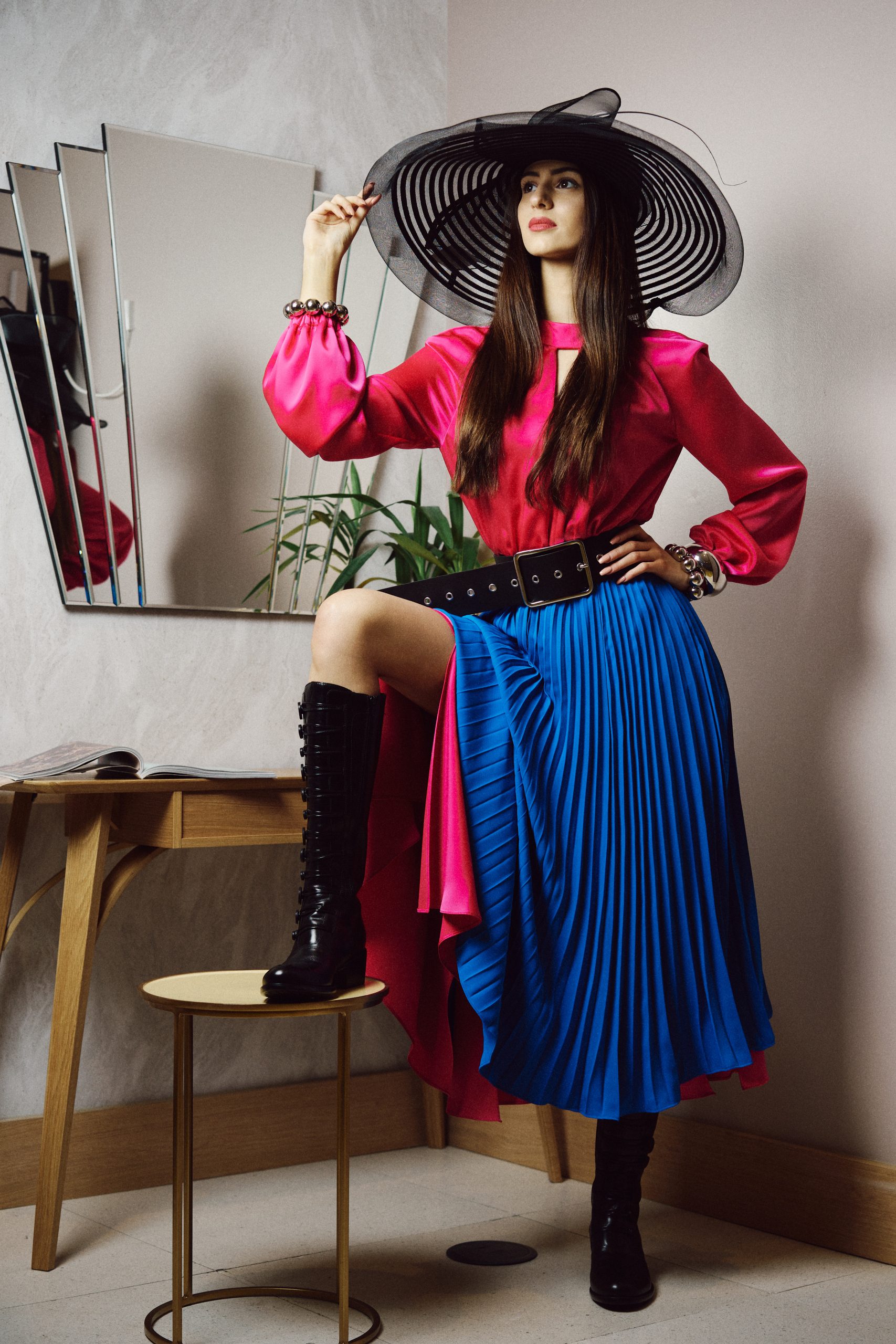
The most subtle toning of the bunch, this adds a bit of film mojo without changing anything drastically. A nice one-click ‘makegoodizer’ and usable as an import preset for general use.
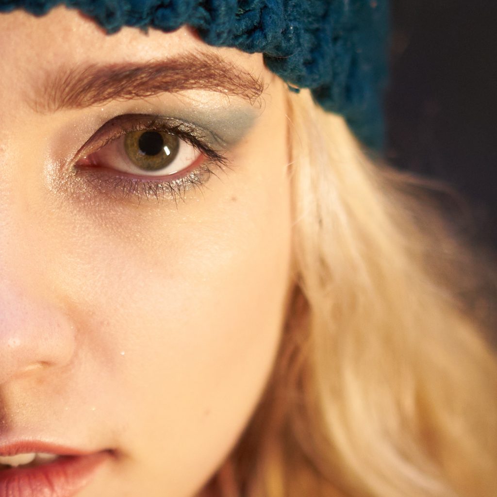
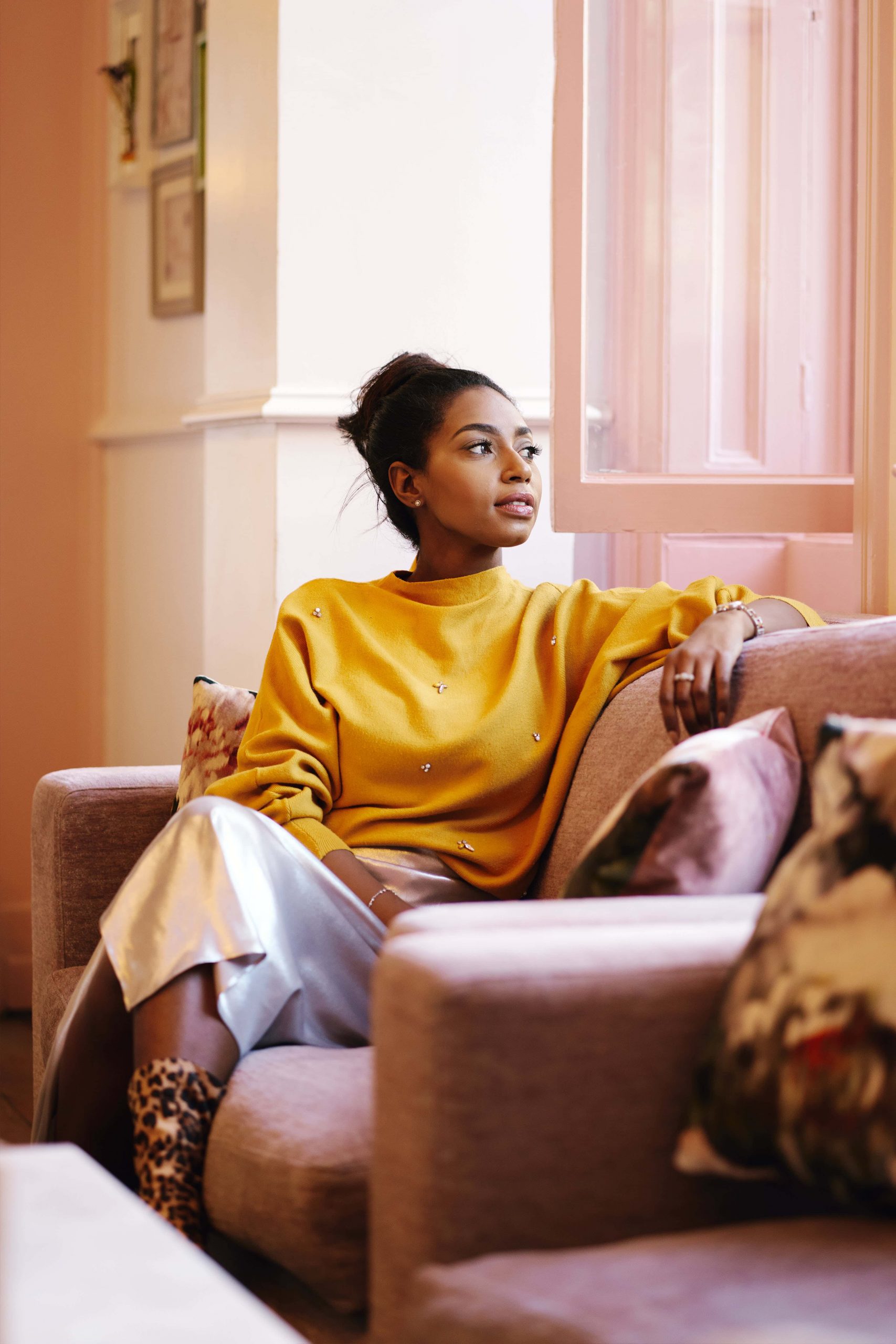
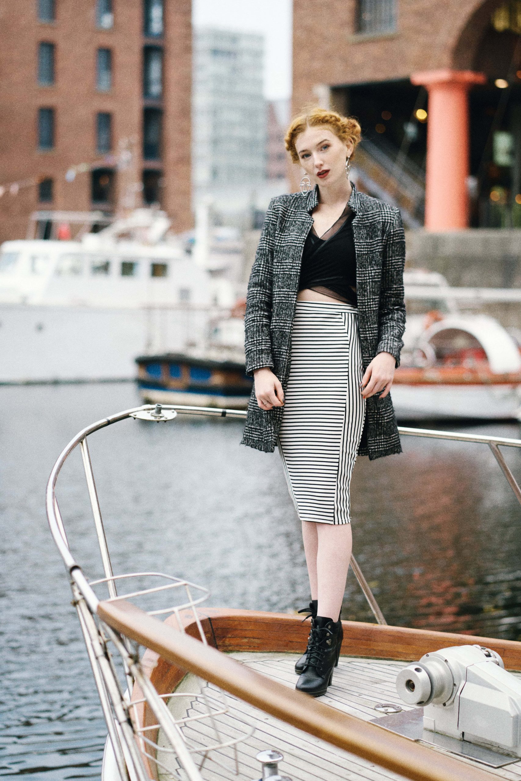
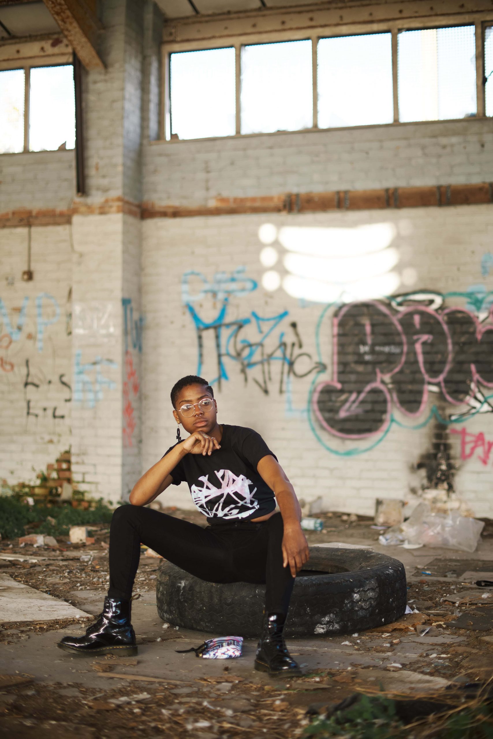
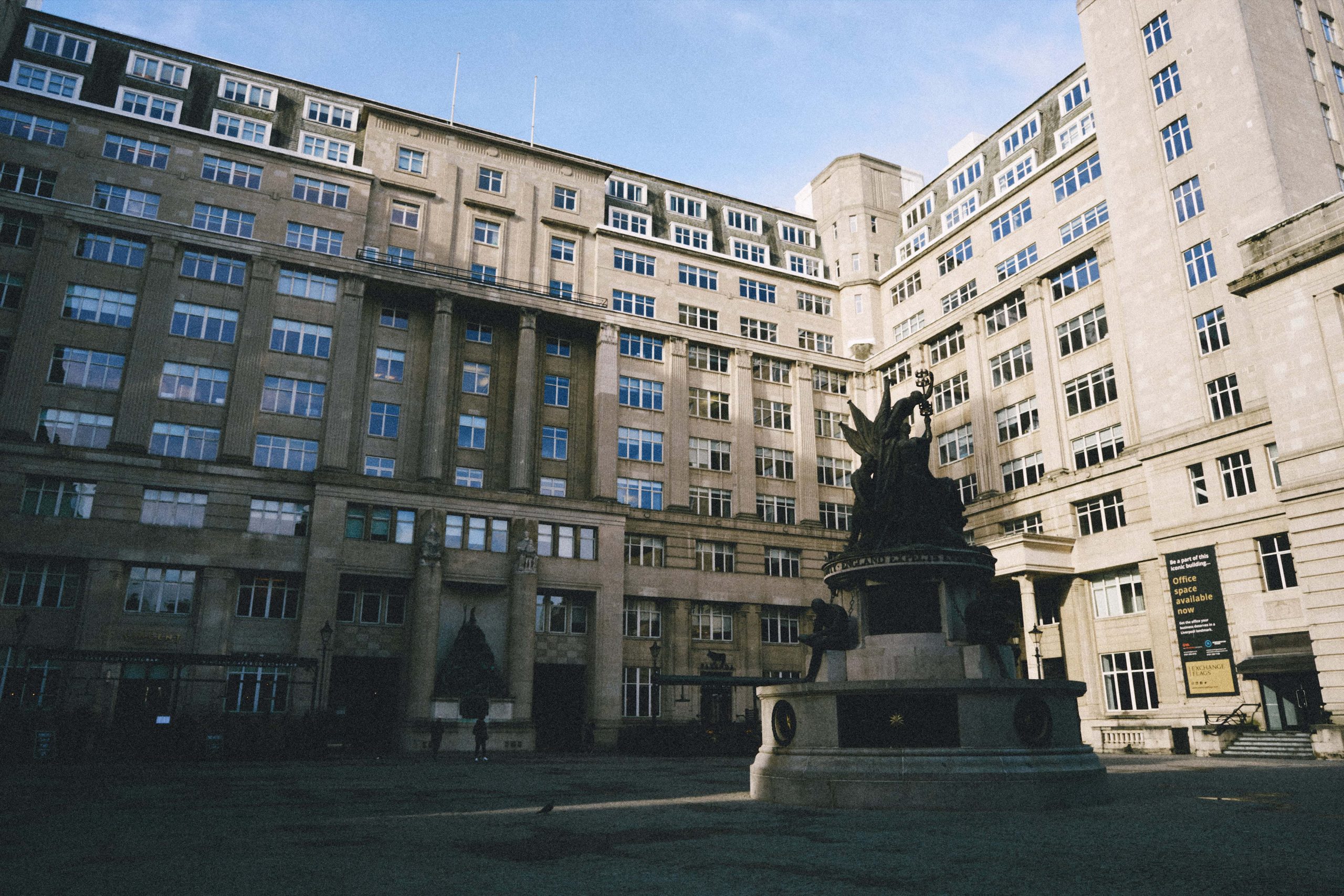
To me this is the closest to a really good lab scan, with rich colours and probably the warmest skin tones in sunlight. You get some of the telltale green to blue shift common in film and a nice boost in contrast. It’s a touch more high-key so you might want to dial back the exposure a tiny bit if it’s too bright for your shot. I use this for weddings.
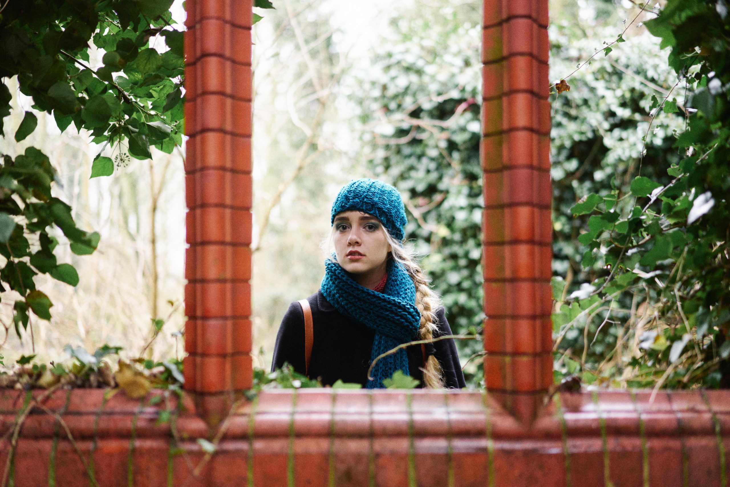
This is a good starting point for most images, especially portraits. There’s a nice bump in contrast, greens shift toward cyan and lovely things start happening to skin tones. It’s a bit more obviously ‘filmy’ than the first two and a little less saturated. Nice all-rounder.
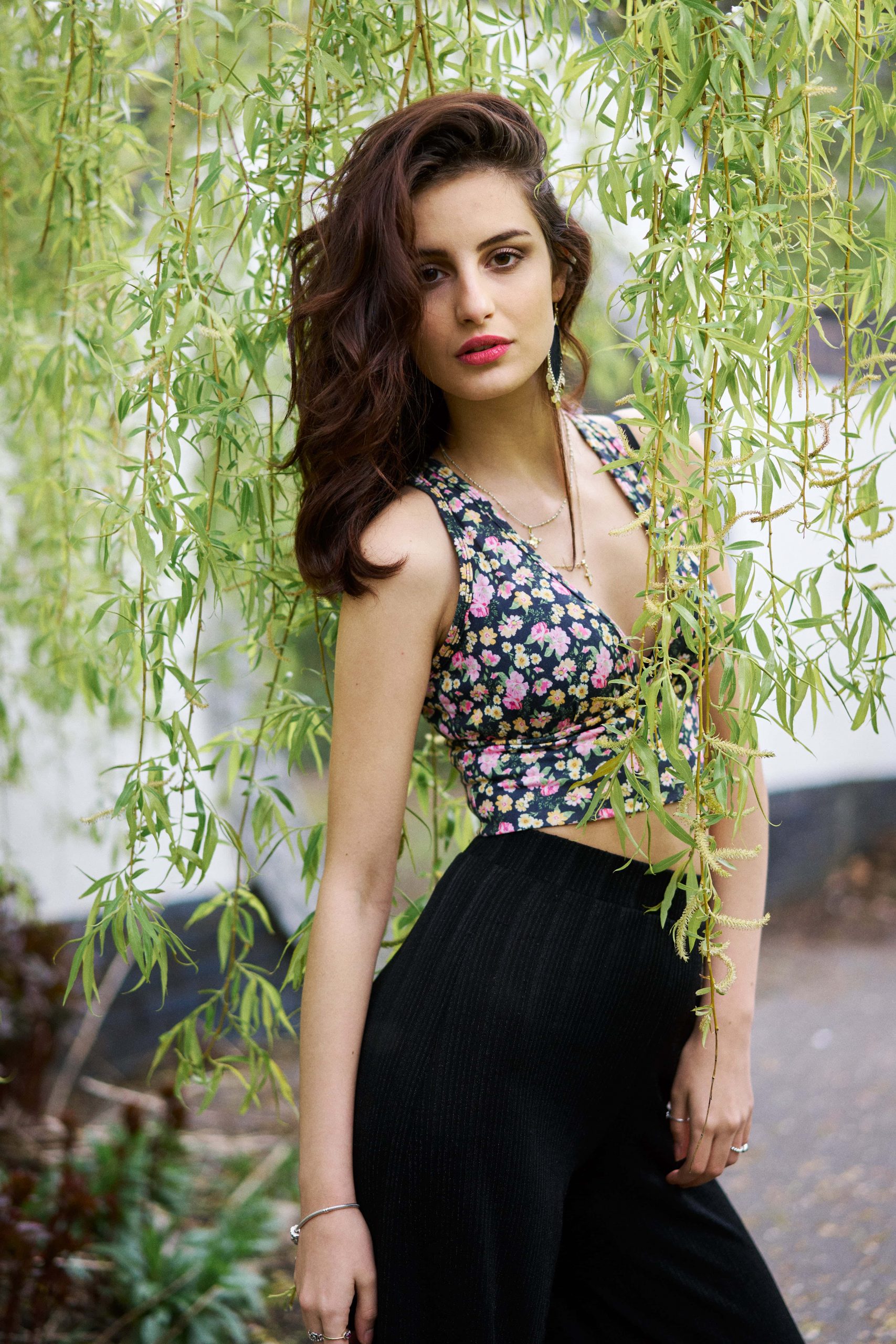
This is my personal favourite! Deeper shadows with a slight lift, rich colours without being oversaturated, a bit of a cyan cast. The first one that’s a noticeable ‘look’. Try stick it on a layer and setting transparency to around 70% for instant film mojo.
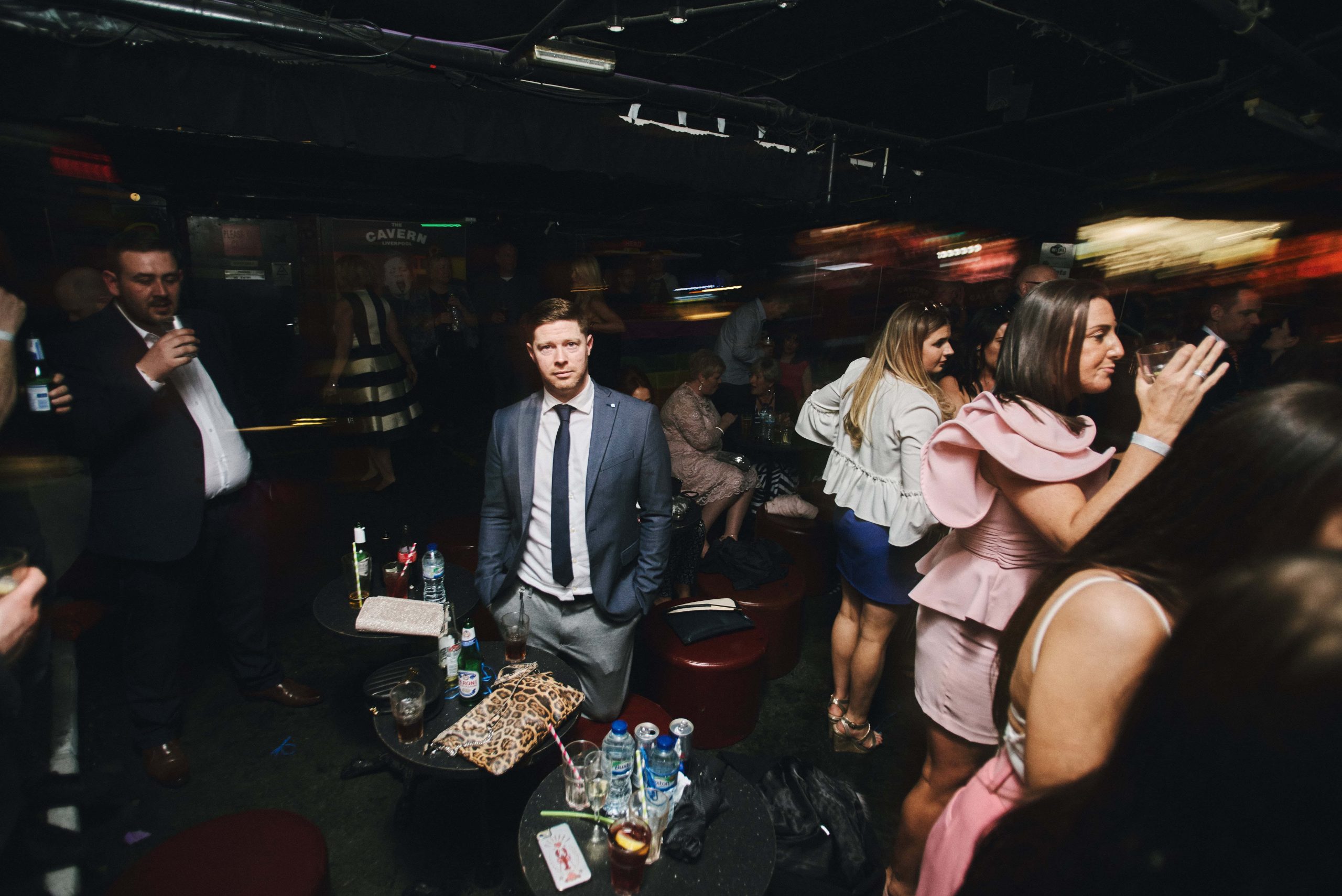
Everything you loved about the previous presets, cranked up a notch! Probably the best one to go for if you want to emulate the typical drugstore lab scans, or cheap prints. Starting to look closer in tone to the Portra 400NC of yesteryear, rather than the new emulsion
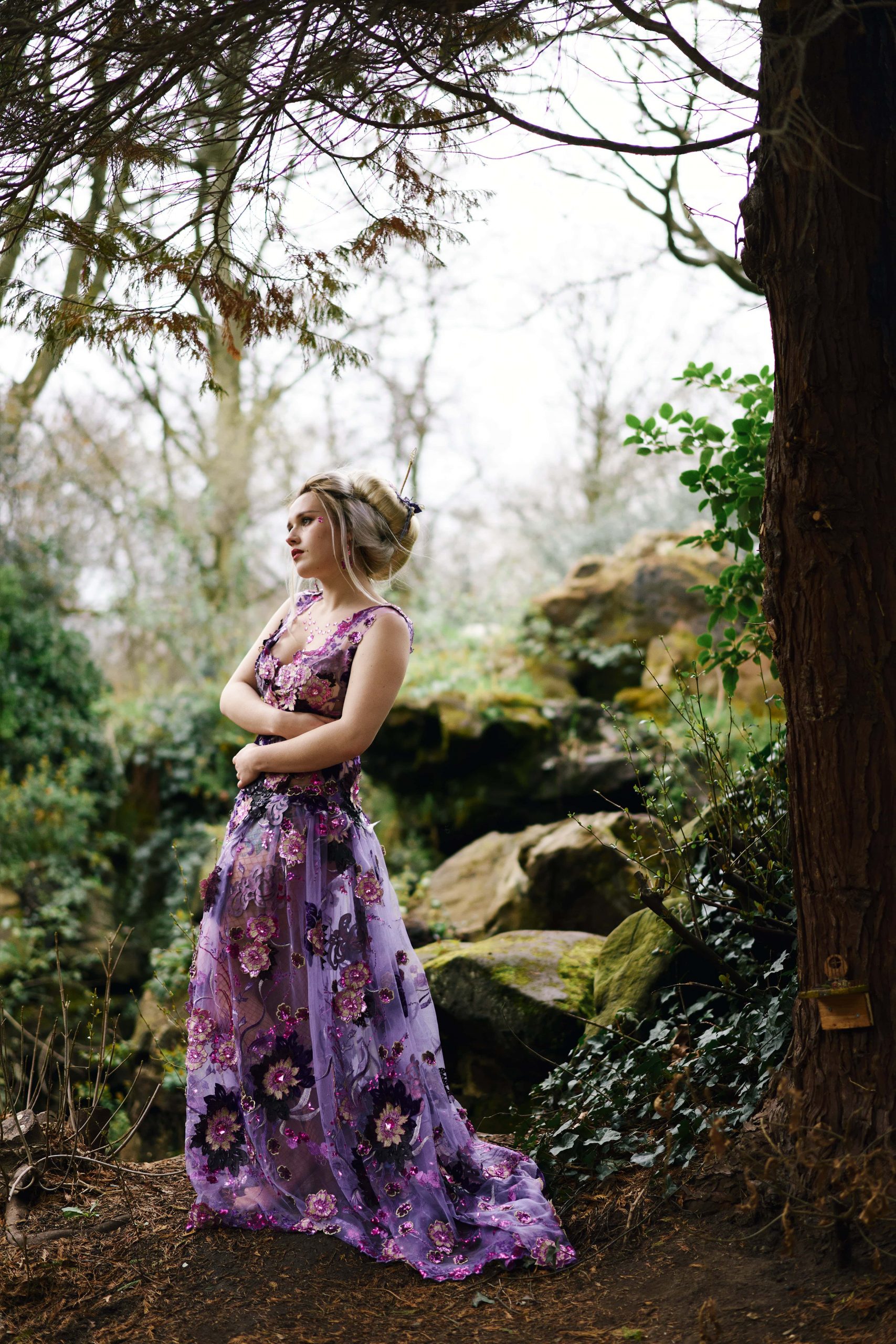
The P stands for ‘purple’. There’s a nice magenta cast to this and slightly deeper shadows. I use it a fair bit for moody fashion work and studio shoots. Can also add a nice grit to street shots.
X is for X-treme! This is designed to be added on a separate layer and blended to dial in as strong an effect as you need. If you want your photos to look like an underexposed negative that’s been hung above a cooker for 20 years, then go right ahead and stick it on 100%. For anything else, dial the layer transparency down until you find the right look.
A similar affair to X1 but A similar affair to X1 but with darker midrange and a nice magenta tint. This doesn’t look much like any Portra I’ve ever shot (if anything it reminds me more of an aging Kodachrome slide) but it’s included since it’s fun. Can make a pretty strong ‘retro’ look if you like your filters a bit on the cheesy fun side, but dialled back to 10-40% opacity it’s a lot more nuanced.
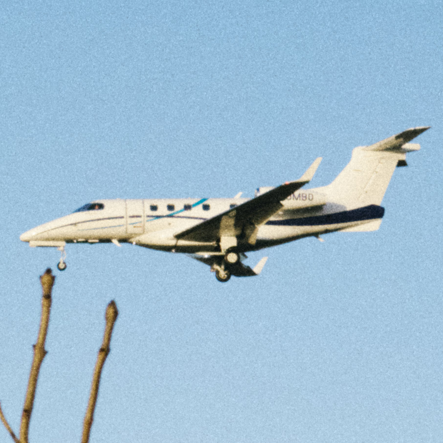
 Digistock Portra 400
 C1 Defaults
 Digistock Portra 400 +
 C1 Defaults
A set of film grain styles designed to pair with the different presets – or mix and match how you like. Having them in a separate folder means the main styles are 100% layer-compatible, but you can still add matched grain in a single click.
Also adds a subtle analog ‘softness’ (can be disabled with one click) which increases along with grain in the more intense patches.
Occasionally film looks like these can have a little too much of a green/cyan cast, especially with certain skintones. ‘De-Greenify’ is a very basic grading shortcut that’ll fix it in a click, ideally blended in as a layer to adjust to taste. Though I usually just nudge the white balance tint a little.
Just a bog-standard matte/fade look., add to give a nice faded vintage vibe. Hipsterlicious! Note that if you apply this directly to an image it’ll overwrite the curves of the original preset, so apply as a new layer and then reduce opacity until you’ve got the right amount of fade.
Applicable only to the Grain presets, this removes the slight ‘analog softness’ (explained on the next page). Does not affect your sharpening settings, it simply resets the ‘structure’ slider.
 Digistick Portra 400 +
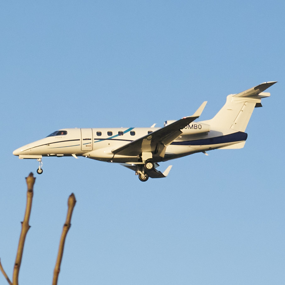 C1 Defaults
We’ve squeezed everything we can out of the Capture One engine to recreate the look of a real film scan with exceptional subtlety (along with less extreme versions).
Here’s some close-ups showing the way we’ve combined C1’s superb grain emulation with softening of details and our unique halation process to create images you’ll find almost indistinguishable from real film scans.
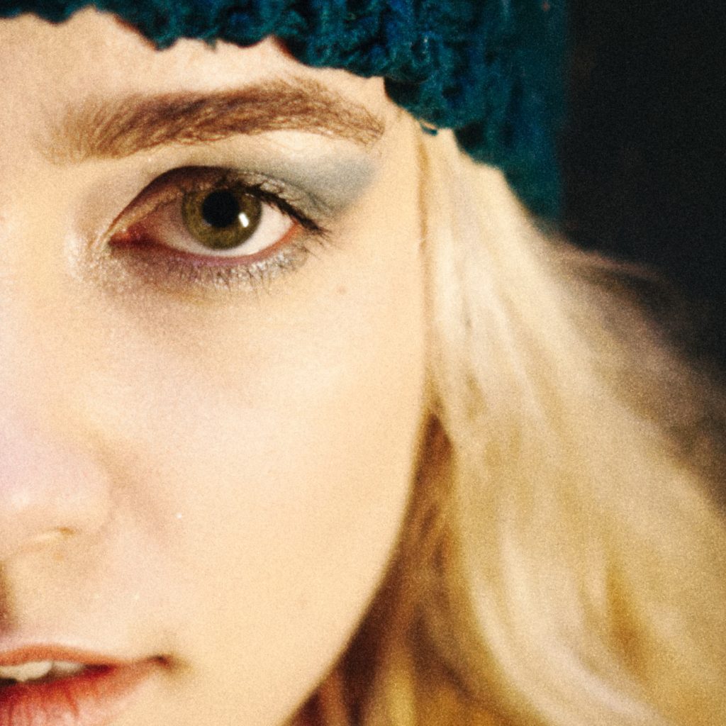 Digistock Portra 400 35mm
 C1 Default
Copyright © 2020 Kyle May Photography. All rights reserved.
‘Ektar’, ‘Kodachrome’, ‘Portra’, ‘Tri-X’, ‘Kodak’, ‘Fuji’ and other trademarks feature to help illustrate customers understand our products’ intended uses, and do not represent an endorsement or licensed product.