
ADVANCED SERIES: Beautiful hybrid styles developed by meticulously shooting, scanning and analysing the real film. Available for both Lightroom and Capture One, with almost exactly the same looks whichever version you choose.
We work hard to create the best film emulations possible for Lightroom, and the ‘Advanced’ series are probably the most technically-complex film looks available. Which is why we called em ‘Advanced’, I suppose…
We’ve created a set of custom colour profiles, combined with convenient one-click presets, to build the most accurate recreations of analog film possible. At the same time they’re versatile enough to use as general-purpose colour grading looks. We give you nice tools, but it’s your choice how to use them.
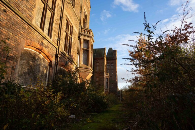
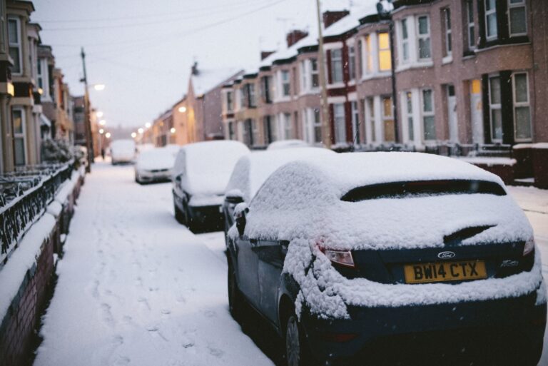
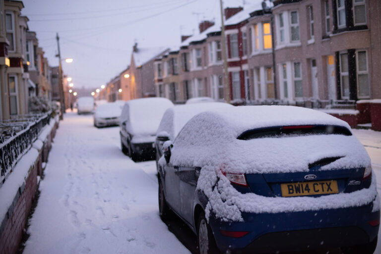
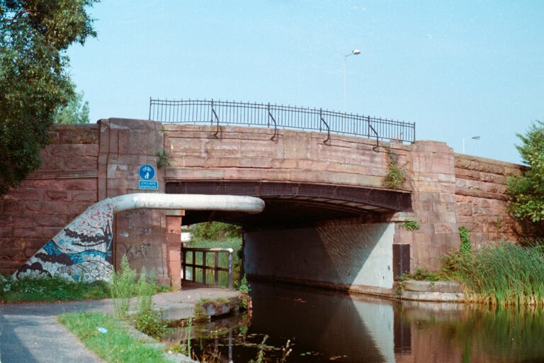
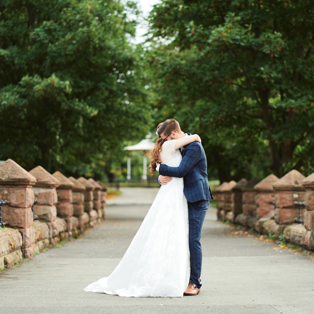
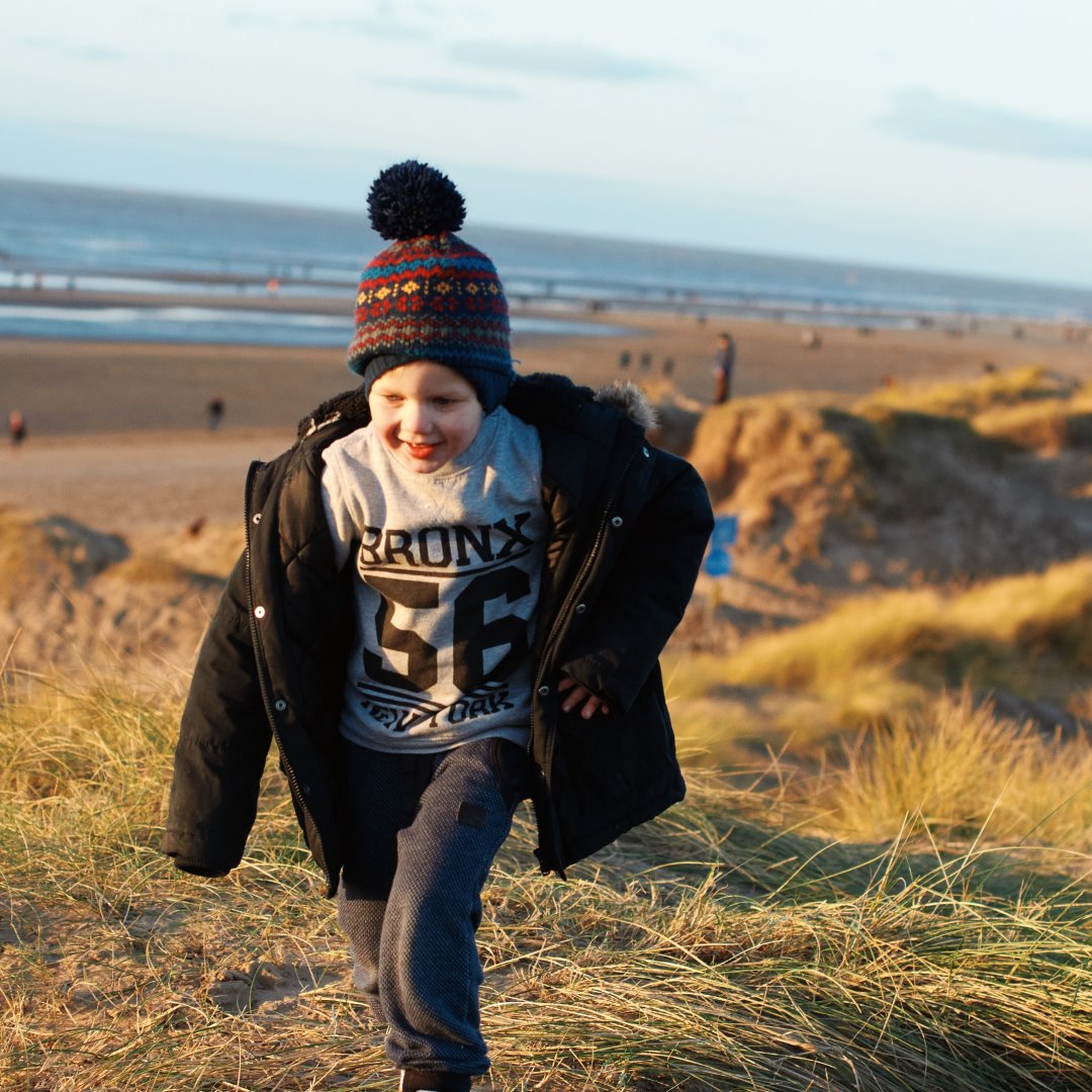
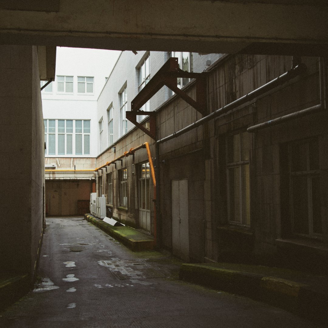
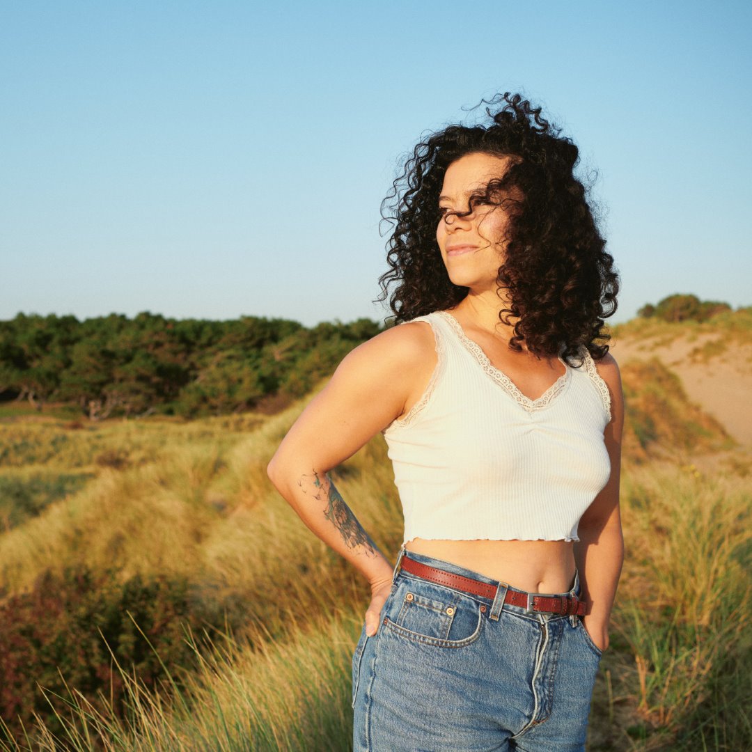
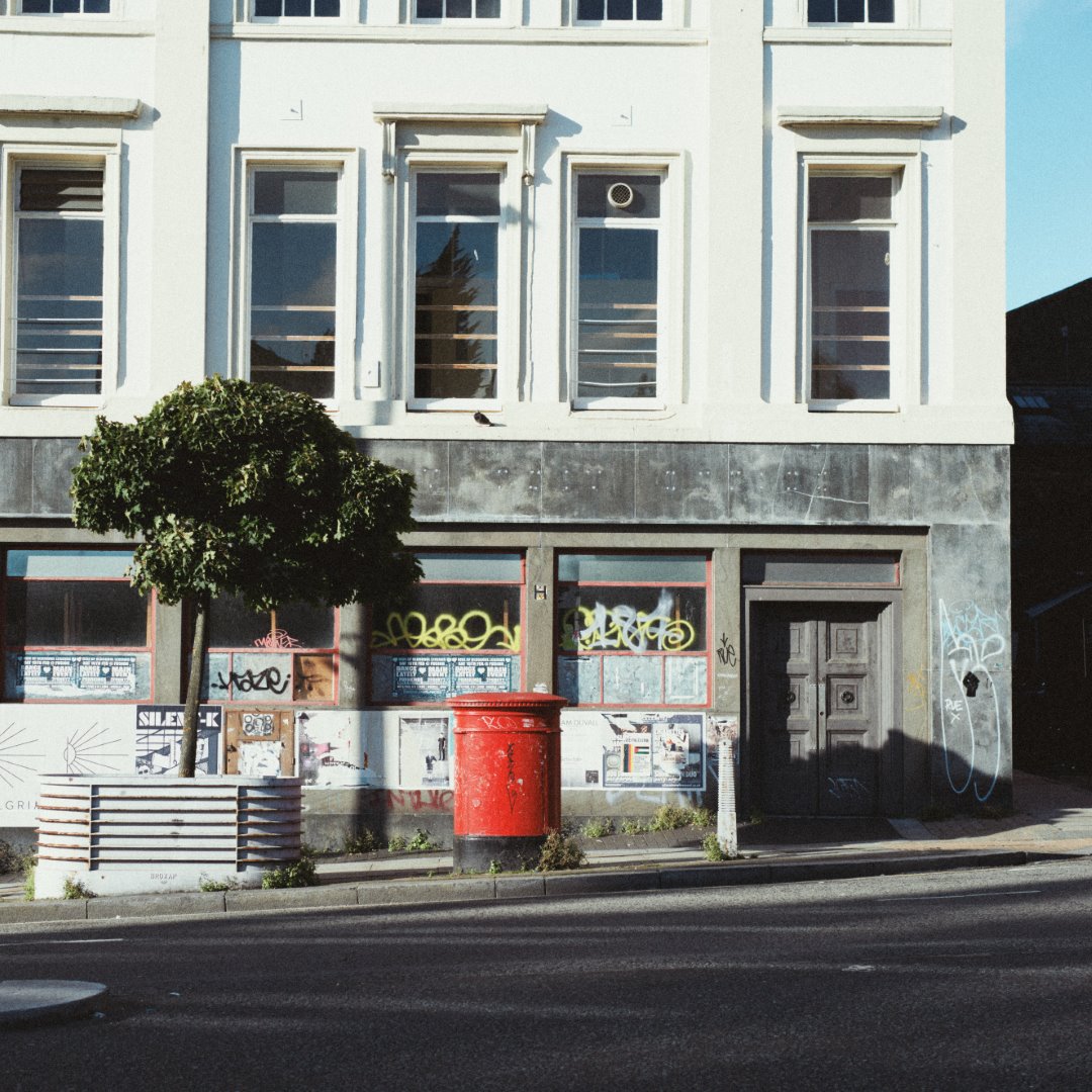
Back in the 80s and 90s, when film was king, Gold 200 was Kodak’s omnipresent consumer film – affordable enough to use for your everyday snapshots, while still offering beautiful rich colours. It’s still available today and though it’s not the sharpest, the most accurate, or the finest-grained stuff on the market, it still holds a special place in many photographers’ hearts. The emulsion sold today isn’t much different from the 1980s formula, so it’s a quick ticket to nostalgic vintagey mojo.
On the technical side it’s an ISO-200, C41 negative film available in 35mm format (110, medium format etc were discontinued long ago – they don’t exactly fit the ‘consumer’ demographic these days!). It gives warm colours – but not oversaturated – and a rather pleasing grain that isn’t the finest available, but still gives you plenty of detail.
It’s the stuff of holidays, family trips, casual snapshots, endless summers; the warm fuzzy haze of fond memories. And we’ve done our best to capture that.
We shot and scanned a variety of test scenes on Gold 200, covering a range of typical shooting and lighting conditions (along with matching shots on digital). After many late nights of studying and tweaking, we ended up with 14 unique colour profiles.
These colour profiles are available to use as LR ‘creative profiles’, which means you can freely adjust the strength from 0-200% to dial in the exact look you want. However we’ve also gone a step further and integrated these profiles into one-click presets, for a total of 17 base looks. There’s also a variety of tools and tweaks to give your photos the look of scanned analog film, as well as handy quick tweaks to strengthen or soften the overall feel of the image.
One lovely bonus is that our Capture One and Lightroom styles duplicate each other almost perfectly, so users switching from one to another (or using both) can get matching results.
Hover over the different presets and see what looks good! Ok, there’s a bit more to it than that but if you want to just jump in and start being creative, go nuts. When you click one of the base looks A1 to C4, yourbase profile will be changed from the standard Adobe Color (or whatever else you’re using) to one of our custom profiles. These are based on the Adobe Color rendering for your specific camera, with our own adjustments to colour and light to recreate the look of the film in specific conditions.
TIP: you may find some presets look better with the white balance tint shifted slightly right (towards pink), if you notice too much of a green cast.
If you like, you can pop open the Profile Browser to adjust the strength with a handy slider. You can reduce it for a more subtle look, or even crank it to 200% for really strong toning (though we didn’t test them at double power!). This browser is also how you select the profiles to use on their own, without clicking the presets.
Some of the presets also make changes to Lightroom’s controls, though we tried to keep it minimal. A few adjust the Tone Curve, and all of them roll off the highlights (with a couple also adjusting the black point), to try and get a film-appropriate dynamic range. However, you can adjust these controls to suit the photo, or your own tastes – it’s just a starting point.
Beyond the main presets we’ve got a section of analog effects, which add grain and gentle softening to reduce the hard digital look. Lightroom’s grain emulation isn’t particularly realistic, so we mostly kept things on the subtle side here.
Below this is a tweaks and tools section, which has a few adjustments to overall colour and contrast. Nothing you couldn’t do yourself, but it’s a handy little single-click way to punch things up (or soften them). There’s also handy presets to toggle lens corrections.
 Digistock Gold 200
 Real 35mm Gold 200
A good question, young grasshopper. The reality is there’s infinite amounts of variation in analog film; unlike digital it’s dynamic and holistic, with every part of the chain affecting the way it looks.
On the right, check out the same negative scanned with two different processes.
Quite a difference, eh? And the only thing changed there is the scanning. There’s no single ‘correct’ look for film shots, whether you scan it or print it. For this pack we decided to use our own lab scanning setup to accurately capture the character of the film, with true-to-life colours. However, since Gold is an everyday, consumer type film, we thought it would also be fun to have it scanned by a local ‘1 Hour Photo’ drugstore-type place, using a Fuji Frontier minilab, to get that classic snapshot look!
Our home lab-scanning setup. Lovely clean timeless colours.
Photo CD from a 1-hour photo lab using a Fuji Frontier.
 Digistock Gold 200 - Warm
 Adobe Color
 Digistock Gold 200 - 1hr Under
 Adobe Color
In total you’ll find 17 unique presets, offering a wide variety of looks based on real film shots with different light and scanning conditions.
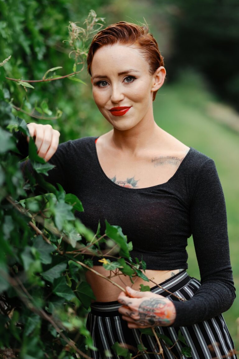
A rich, balanced starting point that adds instant mojo to any photo. You’ll see blue skies shift towards cyan, and a general warmth in reds and skintones.
A slightly more ‘analog’ looking version of the Classic, mixing in a little bit of the 1 Hour Photo drugstore vibe. Slightly cooler and brighter.
We shot some test shots under harsh direct midday sunlight for this profile. Similar to the Classic but with some shifts in the greens and less saturated reds.
Based on test shots taken under outdoor shaded and cloudy conditions. A little more subdued – don’t be afraid to warm up the white balance a bit if skintones look dull.
Very balanced; has a less dramatic effect on skintones and warm colours but still imparts some Gold mojo.
A more subdued look that really puts the ‘gold’ into Gold 200. Rich, soft greens and gentle skintones. One of our favourites.
We intentionally shot some underexposed frames, in shadow and low light, to get a feel for how the film responds. Pair with the heavier grain styles for maximum realism.
More fading, more colour shifts and perhaps a little less saturation. You might want to roll off the highlights as well (though we’ve left the slider alone for you to set how you like).
A more extreme underexposed/expired look, with faded warm shadows and more of a greenish-brown cast.
‘Tungsten’ indicates the colour of old-school lightbulbs, and other artificial light. It’s much more orange than daylight, and Gold 200 is a daylight-balanced film so this orangeness becomes pretty obvious. We’ve modelled the colour response and tonal shifts but not the actual orangeness – that’s what your white balance slider is for! Great for indoor and night shots.
Generally if you’re shooting under tungsten light, you’re either out at night or indoors – and both of those situations are pretty tough for a slow ISO200 film! This is based on slightly underexposed shots under 3200K light, and has very cool shadows like we saw on some scans.
Similar to the previous style, but with the warm orange-green faded areas of shadow we saw a lot shooting Gold 200.
A warmer, less pink version of the underexposed preset, with crushed shadow detail and stronger greens.
The drugstore Frontier scans on CD came out generally cooler, brighter and with muddier shadows than our own manual scans. We’ve replicated that here so you can get the 1 Hour Photo look (no relation to the rather decent Robin Wiliams movie)
Interestingly those quick store scans had a noticeably different look with the shots taken in hard sunlight (probably more due to the scanner’s auto balancing rather than the film itself). We thought it was worth emulating since it’s a little colder and less saturated than our own scans.
The shade shots on the Frontier came out looking quite contrasty and nice – this style is deep and punchy but with warmer, less saturated skintones and reds/oranges.
Based on the ‘shade’ Frontier scans but with the increased muddy, faded shadow areas you see when severely underexposed, and a general shift towards warm/green tones.
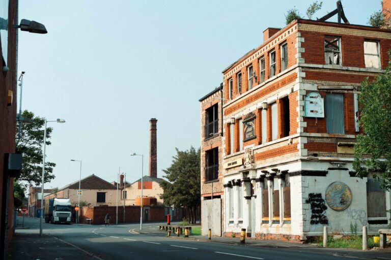
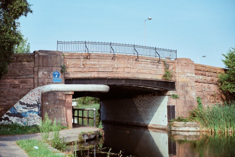
Film images shot on Gold 200 on an Olympus OM-1 with 50mm 1.8 lens, digital images shot on a Sony A7RII using 55mm and 35mm 1.8.
The styles used were not made specifically to match the film test shots! We tweaked the contrast, saturation and white balance to get the closest possible result but all major adjustments came from the Digistock pack.
The 17 main presets above are based upon 14 different colour profiles. These are also available for you to use independently of the presets, if you prefer fine control rather than a readymade look. Simply choose one in the Profile Browser and use the Amount slider to adjust the strength of the look.
Everyday daylight shots scanned with the Frontier lab scanner.
Frontier scans of photos taken in deep shade/overcast light.
Frontier scans from photos taken in harsh midday sunlight.
All-purpose ‘standard’ daylight profile. Looks good on everything.
Alternate all-purpose preset with more contrast and colour cast.
Based on test photos taken in overcast/cloudy conditions or deep shade.
More subtle, relaxed profile based on shots taken in diffused sunlight.
Shot in harsh midday sunlight.
Based on samples taken in 3200K artificial light.
Based on shots that were underexposed in 3200K low light conditions.
Based on deeply-underexposed night shots under tungsten lighting.
Based on intentionally underexposed film shot in daylight conditions.
Based on heavily underexposed film, recovered through scanning.
Based on sample photos shot around golden hour, very similar toning to Under 1.
 Digistock Gold 200 - Warm
 C1 Defaults
 Digistock Gold 200 - Classic+
 Adobe Color
 Digistock Gold 20 - Tungsten Under++
 Adobe Color
An important part of realistic emulation is replicating the film grain and acutance (detail) of the film. Our previous Lightroom packs offered both clean and dirty versions of every preset in separate folders, but to simplify the workflow we now give you clean presets with the option to the analog effects with one extra click. Simply choose one of the four grain strengths.
For maximum realism, these grain presets also reduce the sharpness of the image to simulate the lower resolution of film – we find this helps the grain look like an intrinsic part of the image rather than an overlay, and gets you closer to the look of a film scan.
TWEAKS AND TOOLS
T1) CONTRAST +
Adds a slight contrast increase to the image. Our presets are quite conservatve with contrast, since we believe you’re probably confident enough operating the contrast sliders yourself. Feel free to click this to save a little time though.
T2) CONTRAST ++
Adds a stronger contrast increase to the image and lowers the black point slightly. Depending how you like your scans, you may find you don’t see the ‘Gold look’ in our presets until you’ve added this to them!
T3) PUSH IT TO THE LIMIT
Adds lots of contrast and increases saturation too. If you like a very contrasty, colourful look, click this after choosing your preset. Plus there’s a chance that every time you see this preset, you’ll get the cheesy 80s Scarface song stuck in your head and it’ll get you really pumped up for your editing session. LIMIT!
T4) PASTEL
A nice gentle rolloff of colours and contrast to give a softer, more matte look.
T5) LENS CORRECTIONS ON
By default our styles will respect your normal settings for lens auto-correction, sharpness etc. If you want to quickly enable the aberration/vignette/distortion correction, hit this.
T6) LENS CORRECTIONS OFF
Looking for the ultimate in analog authenticity? Film cameras don’t have any way of compensating for a lens’ characteristics and quirks…so if you’re an analog purist, disabling all the automatic corrections gets you looking closer to the real thing.
 Digistock Gold 200
 35mm Scan
Copyright © 2020 Kyle May Photography. All rights reserved.
‘Ektar’, ‘Kodachrome’, ‘Portra’, ‘Tri-X’, ‘Kodak’, ‘Fuji’ and other trademarks feature to help illustrate customers understand our products’ intended uses, and do not represent an endorsement or licensed product.