
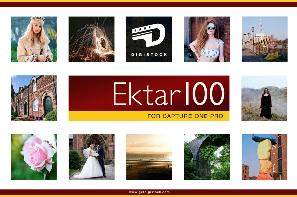
Our most advanced pack yet! Beautiful hybrid styles developed by meticulously shooting, scanning and analysing the real film. Available for both Lightroom and Capture One, with almost exactly the same looks whichever version you choose.
We work hard to create the best film emulations possible for raw editing, and this is without doubt our most geeky and advanced yet. Which is why we called it ‘Advanced’, I suppose. We analysed the film to create custom Lightroom colour profiles, and then used those profiles to build an even wider array of presets replicating the film in different conditions. At the same time they’re versatile enough to use more subtly as a general-purpose colour grading tool.
Ektar 100 is one of the most modern and advanced film stocks on the market, introduced by Kodak in 2008. A product of the digital age, it’s optimised to be highly scannable, with incredibly fine grain and rich colour. Of course, as a colour negative film it still has a unique and distinctive look, noticeably different from results you’d get with any digital camera. Foliage takes on a crisp, bright look with a hint of cyan, blue skies increase in drama, and warm tones shift towards pink. Depending on shooting conditions and scanning, you’ll often get an overall cool look, sometimes with a magenta cast.
This vivid character is ideal for landscapes, snapshots, still life etc, though many photographers shy away from using it for portraits – sometimes the pink tones can give skin a garish look. However, with the right scanning settings it can be a wonderful film for photographing people too.
We shot and scanned a variety of test scenes on Ektar 100, covering a range of typical shooting and lighting conditions (along with matching shots on digital). After many late nights of studying and tweaking, we ended up with 12 unique colour profiles.
Unlike the complex wizardry we had to figure out for Capture One, getting those colour profiles into Lightroom was a breeze . The software supports creative profiles, which can be used to transform the base look from the camera without touching any Lightroom controls. They’re based on the universal Adobe Color profile, meaning you can expect consistent results from any camera. Best of all, you can adjust the opacity to tweak them to your tastes. You can use these profiles as a one-click look, but we went a step further and built a robust collection of presets to fine-tune the look for different conditions, as well as some handy tools and utilities. One lovely bonus is that our Capture One and Lightroom styles duplicate each other almost perfectly, so users switching from one to another (or using both) can get matching results. In the following pages we’ll explain a bit more about the technical stuff and – much more importantly – how you can use the results of our complicated nerdy work to make your pictures look good.
We try and find a balance between giving you lots of options, and not making things too cumbersome or fiddly to use.
Once installed, you’ll start with a choice of two folders, Analog and Clean. Both contain the same set of presets, however the Analog versions emulate the look of a typical Ektar scan by adding appropriate film grain, and adjusting sharpness/acutance. The clean versions offer the same overall look, but without adding grain or altering your detail settings.
Inside the folder you’ll find 15 main looks, A1 to C2, offering a number of variations covering the look of Ektar 100 under different lighting conditions and scan settings. The differences between these styles are explained below; however it’s useful to know that you can adjust the opacity of the colour profiles (the very first setting in the Lightroom editing panel) and mix and match them with presets, to fine-tune the look you want.
There’s also quick adjustments included, for those who want to a little more punch to the base presets.
We kept our presets quite natural-looking, and it’s absolutely fine to want to add more contrast. Some companies really overdo the contrast to give you that initial ‘wow’ factor when you first use em, but we prefer to keep things more lifelike for you to dial in the way you want.
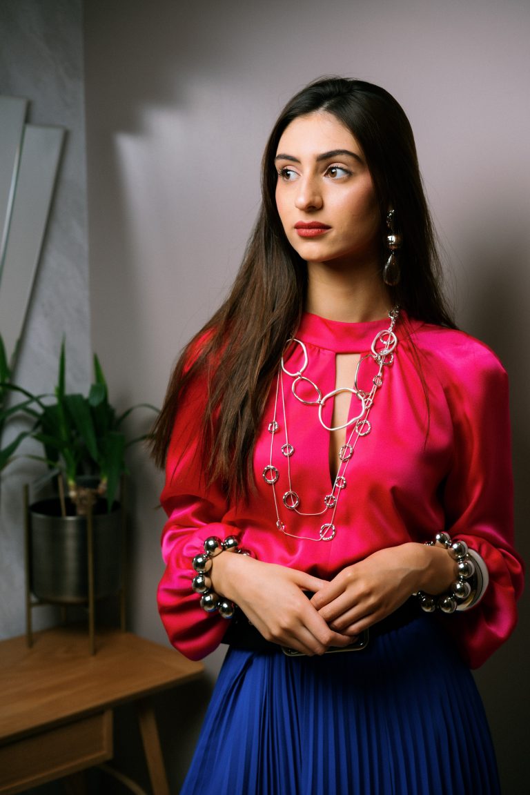 Digistock Ektar 100 - Shade
 Lightroom Defaults
A good question, young grasshopper. The reality is there’s infinite amounts of variation in analog film; unlike digital it’s dynamic and holistic, with every part of the chain affecting the way it looks.
On the right, check out the same negative scanned with two different processes.
Quite a difference, eh? And the only thing changed there is the scanning. There’s no single ‘correct’ look for film shots, whether you scan it or print it. We made the decision early on to base our styles on the output of Noritsu scanners, specifically the HS1800. Noritsu are probably the gold standard for scanning Ektar, though it can sometimes have a bit of a pink cast. We made profiles based on this default look of the scanner, as well as corrected scans!
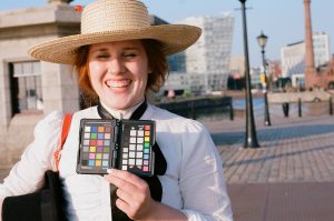
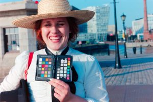
This is our lovely friend Gabby, by the way. We were doing a little vintage shoot and got her to pose for some Ektar test shots. Skintones are very important!
You can tell the difference, right? Can you pick which is which?
 Digistock Ektar 100 - Bright Sunlight
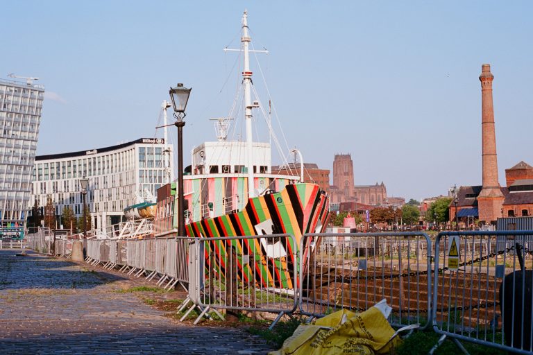 Real 35mm Ektar Scan
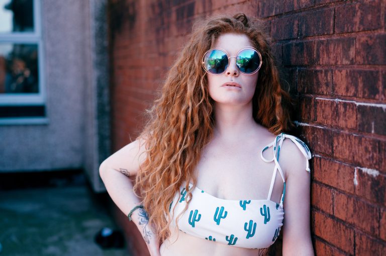 Digistock Ektar 100 - Raw Scan
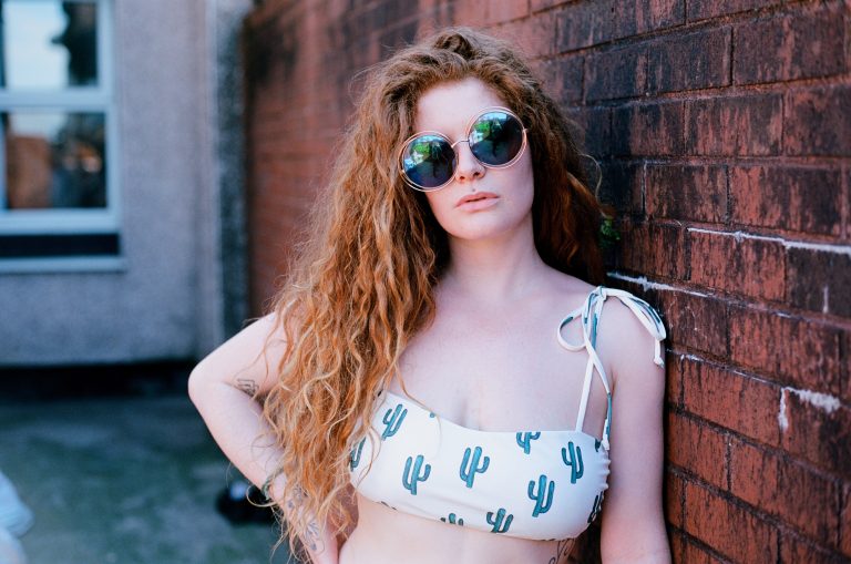 Real Ektar 35mm Scan
Now we’re getting into the real meat-and-potatoes of the pack! Once you’ve picked your desired strength you’ll be greeted by 15 lovely new presets. You can read this to find out a bit more, or just click em – I mean, if it looks good, it is good.
Based on well-corrected scans, with a nice neutral look. Rather subtle but you’ll see some little changes in greens and orange/reds, and cooler shadows.
If in doubt, use this one. Based on lightly-corrected Noritsu scans, you get that punchy, cool Ektar look with plenty of contrast and saturation. If highlights or skintones get a little too pink, there are tweak tools you may find useful.
If you take your film to a lab and they leave the scanner set to defaults, this might be the kind of result you can expect. Quite a cool/pink tone which works great for a lot of stuff.
The same base profile but with things jazzed up a bit. Some of the Noritsu scans came out looking a bit too flat and natural for the typical Ektar look, so more contrast and saturation was helpful.
This is based on some test scenes shot in a very sunny English garden around midday on a hot June day. I’m glad I did, because July has been remarkably horrible, cloudy and grey. English weather, folks! These have almost a Fuji look – greens are really cyan, and highlights have a magenta tint that reminds me of Pro 400H.
If you’re shooting in any kind of shade or overcast weather, give this a try. Your white balance will still dictate the overall balance of the shot (try around 5200K to get closest to the real film), but this will really alter the colour response. This works well for portraits too, I’ve found.
The underexposed test shots were made both in direct sunlight, and under studio lights. The colour profile mostly handles the colour shifts etc, while the curves to get the lifted shadows were done inside C1, so if you find the fading a bit too much just reset the curves tool.
The fading gets much stronger here but it’s based on the indoor scans, again reset the curves tool if you just want colours shifts etc. Looks more realistic with strong grain applied.
The fading might look pretty over-the-top like an Instagram filter but we promise it’s based on reality! Shadows turned to brown mush when we shot several stops under and brightened it in post.
‘Tungsten’ means the colour of old-school lightbulbs, and other artificial light. It’s much more orange than daylight, and Ektar is a daylight-balanced film so this orangeness becomes pretty obvious. We’ve modelled the colour and tonal shifts but not the orangeness – that’s what your white balance is for! Great for indoor and night shots.
If you’re shooting an ISO100 film at night or indoors, underexposure isn’t going to be much of a surprise. We noticed quite a big shift from the properly-exposed Tungsten shots; this might just our scanner being funny but we modelled it anyway.
Based on a different set of scans to B2, these exhibited more of a green tint in shadow areas and a generally colder look.
The murky brown shadows are pretty accurate to our scans, but once again don’t forget that you can disable the curves tool for a much less faded look.
There’s a fair bit of latitude with Ektar – a lot of the shots didn’t show a huge tonal difference when overexposed. We exposed for the shadows a lot anyway. But in some images there was an increased magenta tint and some nice shifting in blue skies.
Ektar isn’t a film that’s routinely pushed and pulled the way some stocks are – it’s already got a lot of contrast and the grain is incredibly fine at box speed, so there are fewer compelling reasons to. We decided we couldn’t justify shooting and scanning an entire roll pushed, so we got into the general ballpark based on different scans and sample images. You’ll get cool tones and strong contrast with plenty of saturation.
Film images shot on Ektar 100 on an Olympus OM-1 with 50mm 1.8 lens, digital images shot on a Sony A7RII using 55mm 1.8. Film scanned using the Noritsu HS1800.
The styles used were not made specifically to match these test shots! We tweaked the contrast, saturation and white balance to get the closest possible result but all major adjustments came from the Digistock pack.
The 15 presets above are based upon 12 different colour profiles.
These are also available for you to use independently of the presets, if you prefer fine control rather than a ready-made look. Simply choose one in the profile browser and use the Amount slider to adjust the strength of the look.
Ektar 100 Natural – subtle look based on highly corrected scans
Ektar 100 Classic – based on typical scans with light corrections
Ektar 100R – based on typical Noritsu default output
Ektar 100 Raw – alternate based on different scanner settings
Ektar 100D1 – based on shots taken in bright midday sunlight
Ektar 100S – based on test shots taken in shade
Ektar 100T – based on shots taken under tungsten lighting
Ektar 100D -1 – based on outdoor daytime shots we intentionally underexposed Ektar 100D +1 – based on overexposed daytime shots
Ektar 100T -1 – based on underexposed shots in artificial tungsten light
Ektar 100T -2 – based on heavily underexposed shots under tungsten light
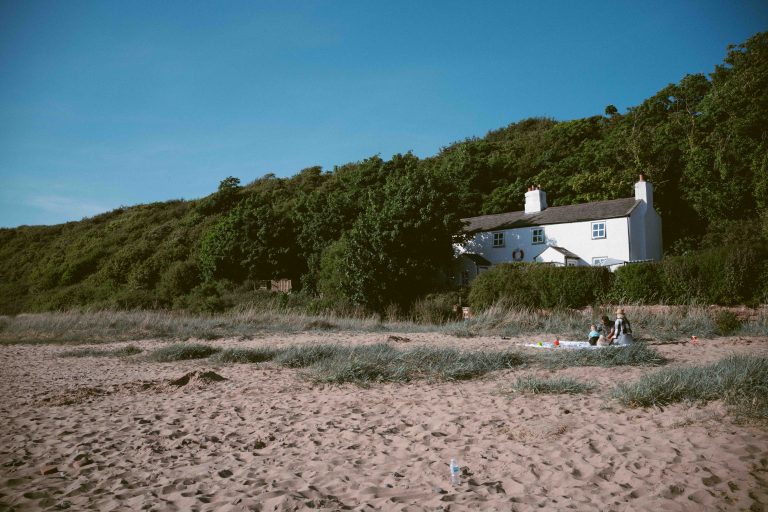 Digistock Ektar 100 - Underexposed -1
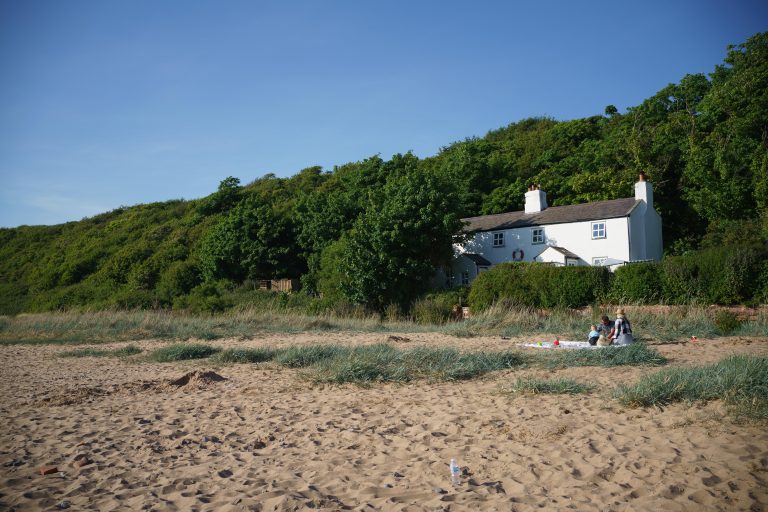 LR Defaults
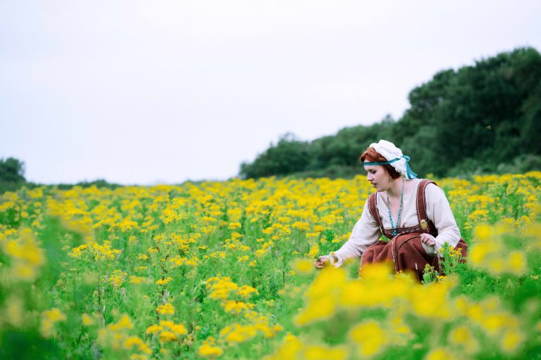 Digistock Ektar 100
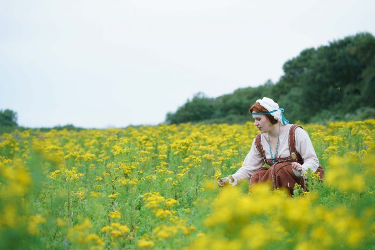 LR Defaults
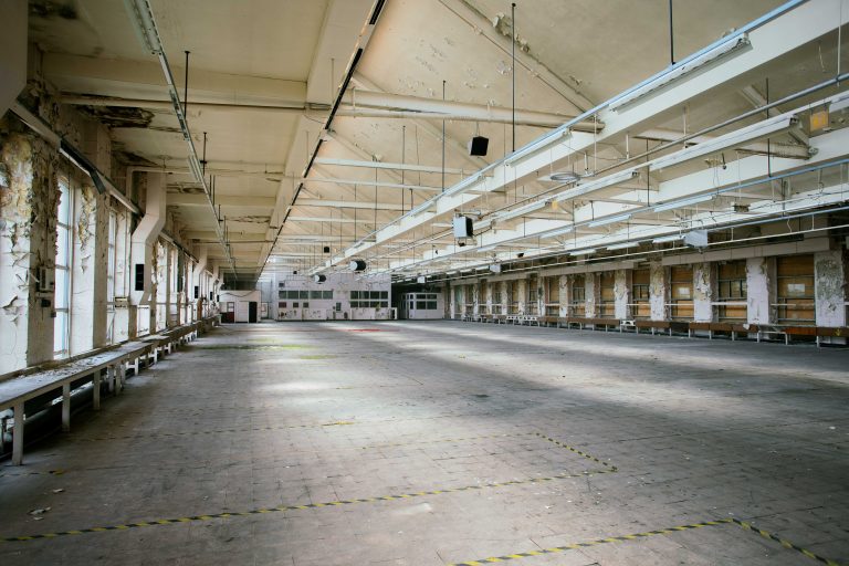 Digistock Ektar 100 - Shade
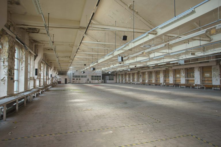 LR Defaults
Adds a slight contrast increase to the image. Our presets are quite conservative with contrast, since we believe you’re probably confident enough operating the contrast sliders yourself. Feel free to click this to save a little time though.
Adds a stronger contrast increase to the image and lowers the black point slightly. Depending how you like your scans, you may find you don’t see the ‘Ektar look’ in our presets until you’ve added this to them!
Adds lots of contrast and increases saturation too. If your take on Ektar is the uber-contrasty, colourful look, click this after choosing your preset.
Plus there’s a chance that every time you see this preset, you’ll get the cheesy 80s Scarface song stuck in your head and it’ll get you really pumped up for your editing session. LIMIT!
By default our styles will respect your normal settings for lens auto-correction, sharpness etc. If you want to quickly enable the aberration/vignette/distortion correction, hit this.
Looking for the ultimate in authenticity? Film cameras don’t have any way of compensating for a lens’ characteristics and quirks…so if you’re an analog purist, disabling all the automatic corrections gets you looking closer to the real thing.
Do you want to add just a hint of texture to your image? We’ve dialled in a less intrusive grain setting to add a little mojo without being obvious. Most film scanners use noise reduction by default, after all. Lightroom’s grain simulation isn’t very realistic, sadly, so we prefer to keep things on the subtle side.
Copyright © 2020 Kyle May Photography. All rights reserved.
‘Ektar’, ‘Kodachrome’, ‘Portra’, ‘Tri-X’, ‘Kodak’, ‘Fuji’ and other trademarks feature to help illustrate customers understand our products’ intended uses, and do not represent an endorsement or licensed product.